Not just another logo
A logo with a story to tell!

The symbolism
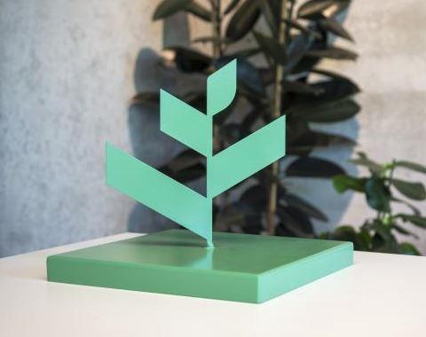
Have you ever noticed that the upper part of our logo does not have sharp angles, but rather curves reminiscent of a leaf? That's right, because it is a subtle reference to greenery and plants, the natural habitat of the Deforche Construction Group.
The powerful symmetry effect
But it goes further ; the main supporting element is the ridge structure.
Imagine drawing a vertical line in the middle of the logo, and the white and colored areas mirror each other perfectly. And because the areas taper from the base to the top, refinement and height are created. Like a plant growing towards the sky.
All pure nature
And the colours? No, there is no great philosophical theory behind that. We simply opt for soft, natural tones. Nothing artificial, all pure nature!
Co-creation: Finding solutions together
Or maybe you see a sharp building with lights still on some floors? A unique construction, it's all possible.
That's what we love! Working together with our clients! We enjoy listening, empathetic and with a generalist approach, and then together, we seek the best solutions, creatively and innovatively. Our over 90 years of experience have taught us, among other things, that co-creation is the key to success.